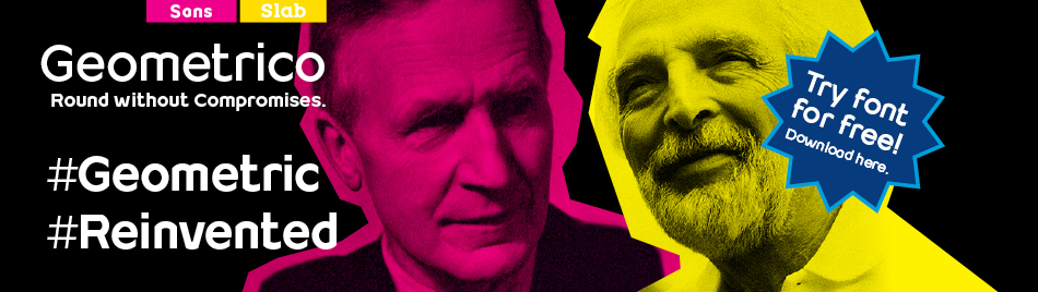
Geometrico. Round without Compromises. Font Mimix.
[X]
![]()
Here you will find design examples realized with the font family Mimix by us and other designers.
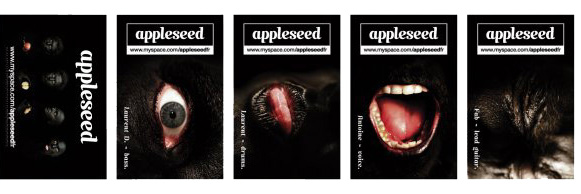
A set of postcards for the music group “Applessed” by the French graphic designer Jérôme Menuet.
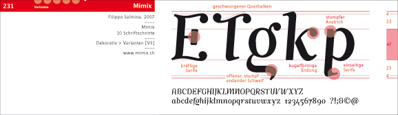
A font specimen realized by the designers and teachers Richard Frick and Samuel Marty for the “Hochschule der Künste Zürich” in collaboration with the “Berufsschule für Gestaltung Zürich”.
A poster made with the font Mimix by the Spanish graphic designer Lucia Soto during her project “100 Días de tipografía”.

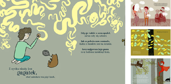
A children book set completely in the font Mimix by Aleksandra Woldanska, graphic designer, Poland.
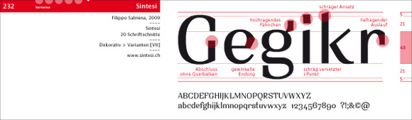
A marriage invitation card designed by the Swiss graphic designer Filippo Salmina with the font Mimix.
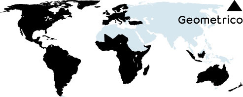
Here you will find design examples realized with the font family Geometrico by us and other designers.
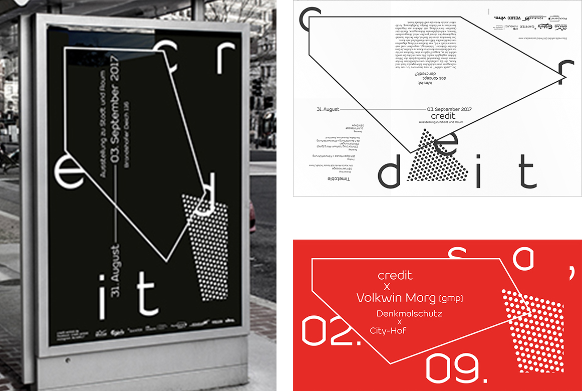
Poster, Flyer and complete digital communication for the Exhibition “credit exhibit” realized with Geometrico by the Graphic Designer Nils Poppe.
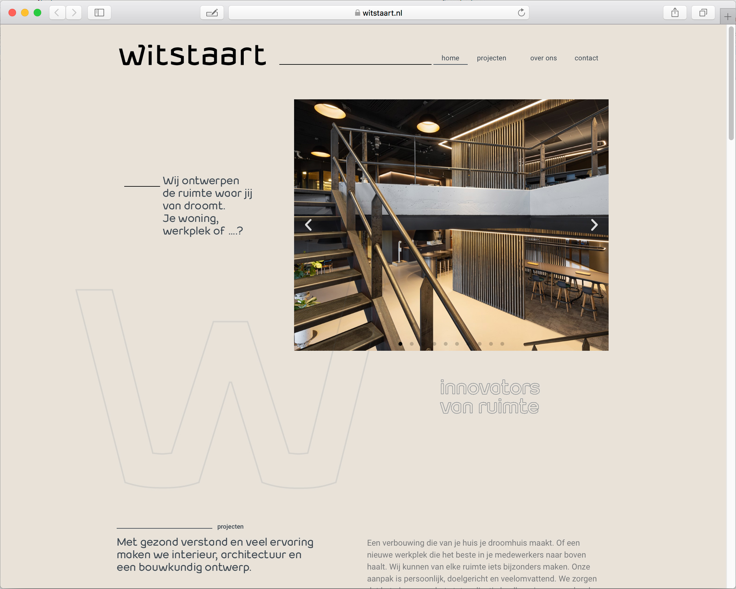
Corporate design by architects Witstaart in the Netherlands implemented using the Geometrico Typeface.
Here you will find design examples realized with the extended font family Sintesi by us and other designers.
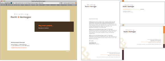
Corporate identity and logo of the Belgian Foundation “Stichting Recht & Vermogen” realized completely using Sintesi Semi by the agency INXCO bvba.
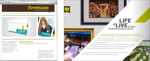
Corporate identity, logo and website of the German communication agency formhouse GmbH realized completely using Sintesi Sans and Sintesi Semi.
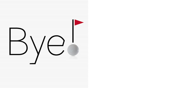
Farewell card realized using Sintesi Semi by the Swiss graphic designer Filippo Salmina.
Font specimen realized by the designers and teachers Richard Frick and Samuel Marty for the “Hochschule der Künste Zürich” in collaboration with the “Berufsschule für Gestaltung Zürich”.
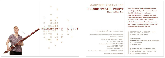
Invitation flyer for a solo bassoon concert of the musician Natalie Holzer realized using Sintesi (SemiSerif) by the Swiss graphic designer Madeleine Matter.
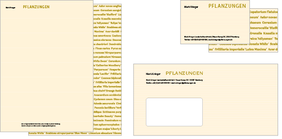
Corporate identity and logo of the German landscape architecture bureau “Mark Krieger Planting” realized exclusively using Sintesi (SemiSerif).
How courageous and innovative were Paul Renner and Herb Lubalin with their font designs! In comparison, today’s Swiss font design scene can be described as flattening out. More or less “accurate” variants of the Helvetica font are being “warmed up” more and more. We do not appreciate this development and are offering here consciously typefaces that you wouldn’t necessarily expect under the term “Swiss Design”.
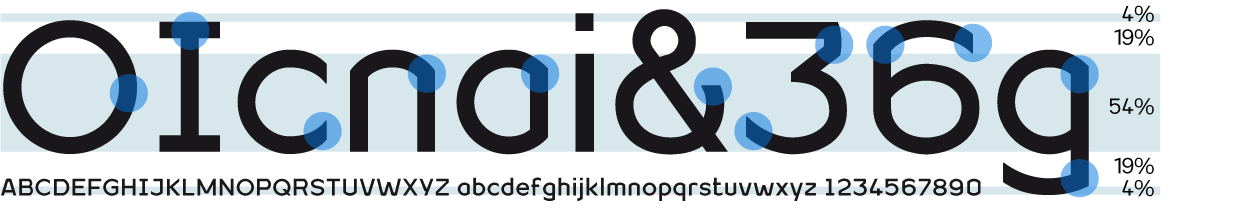
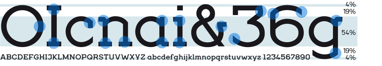
For the 90th anniversary of the typeface “Futura”, Geometrico was designed: a new interpretation of the Bauhaus classic and a tribute to Paul Renner. “How many circular elements can be used in a typeface?”, asked himself the author. “Futura” contains already 13 circular elements in the minuscules only, the new font family Geometrico 15. Does the readability suffer?
![]() Copy
Copy ![]() Short
texts
Short
texts ![]() Headline
Headline ![]() Experimental
Experimental
1 style 39 $, font family (24 styles) 149 $
Are
you looking for a modern typeface?
Even more futuristic than the classical Bauhaus typeface Futura, “Geometrico”
is a geometric typeface based on round shapes as suggested by its name. Designed
without compromises, neither in form nor in function: Geometrico is ideal for
logotypes, headlines and other modern typographic purposes. Would Paul Renner
be delighted? Or would he turn around in the grave? Make your own opinion.
Try Geometrico for free.

OpenType for Mac and Windows. Avaliable as webfont.
![]() Copy
Copy ![]() Short
texts
Short
texts ![]() Headline
Headline ![]() Experimental
Experimental
1 style 39 $, font family (24 styles) 149 $
Are you looking for a modern italic? In response to a general request, an italic variant was added to the Geometrico font family. This was essentially created by slanting it, with appropriate optical corrections, and is characterized by the closest possible match with the straight one. Particular care was taken to keep the circular geometric elements intact as possible.

OpenType for Mac and Windows. Avaliable as webfont.
![]() Copy
Copy ![]() Short
texts
Short
texts ![]() Headline
Headline ![]() Experimental
Experimental
1 style 39 $, font family (22 styles) 149 $
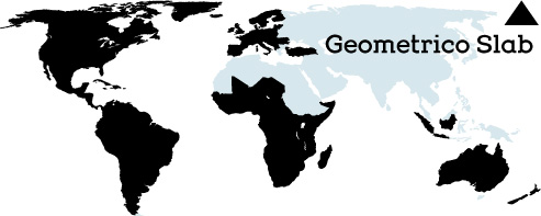
Should it express power? Geometric and Slabserifs: a relatively rare combination. GeometricoSlab takes its cue from Herb Lubalin’s typeface family of the same name, and by using optical corrections with restraint, it looks a touch more uncompromising. The flexible, partly asymmetrical arrangement of the serifs avoids an overly heavy effect. The typeface family is suitable for both headlines and small point sizes. Curious? Try Geometrico Slab free of charge.

OpenType for Mac and Windows. Avaliable as webfont.
![]() Copy
Copy ![]() Short
texts
Short
texts ![]() Headline
Headline ![]() Experimental
Experimental
1 style 39 $, font family (22 styles) 149 $
Looking for a modern slab serif? A cursive variant has been added to the Geometrico Slab type family. This was created essentially by slanting with appropriate optical corrections and is characterized by the greatest possible conformity with the upright styles. Care was taken not to affect the circular geometric elements as much as possible.

OpenType for Mac and Windows. Avaliable as webfont.
![]() Copy
Copy ![]() Short
texts
Short
texts ![]() Headline
Headline ![]() Experimental
Experimental
1 style 39 $, font family (22 styles) 149 $
Looking for a geometric yet flexible character? Teorema is related to the popular Geometrico font family. According to a pragmatic approach that favors flexibility and ease of maintenance, a new geometric typeface was created. The font is distinguished by the contrast between perfectly circular shapes, and other, more angular ones in search of a formal balance aimed at optimizing the recognizability of the characters and finally the legibility of the text. Worthy of a geometric “theorem”? Try Teorema for free.

OpenType for Mac and Windows. Avaliable as webfont.
![]() Copy
Copy ![]() Short
texts
Short
texts ![]() Headline
Headline ![]() Experimental
Experimental
1 style 39 $, font family (10 styles) 149 $
Cool, young and fresh, Segno surprises with his informal character and convinces for its careful execution. Its rounded forms and serifs evoke discretely the flow of a brush. Due to its moderate inclination Segno is easily readable and suits to more typographic purposes than you probably would expect from an informal typeface. Add a splash of freshness to your artwork, with Segno.

OpenType for Mac and Windows. Avaliable as webfont.
![]() Copy
Copy ![]() Short
texts
Short
texts ![]() Headline
Headline ![]() Experimental
Experimental
1 style 39 $, font family (20 styles) 199 $
Sintesi Sans is the
font used for the copy of this website.
Sintesi Sans, a humanisctic sans serif, scores because of its readability,
robustness and contemporary style. It is a true Sans Serif and therefore
really flexible, universally applicable, especially as a body text font
and in a large number of applications. Thanks to its good readability
and wide set of styles and glyphs, Sintesi Sans suits perfectly to a
wide spectrum of applications.

OpenType for Mac and Windows. Avaliable as webfont.
![]() Copy
Copy ![]() Short
texts
Short
texts ![]() Headline
Headline ![]() Experimental
Experimental
1 style 39 $, font family (20 styles) 199 $
Are you looking for a robust, contemporary font with strong personality?
Sintesi Semi is a hybrid font which manages the “synthesis” between Sans and Serif in its own way. Due to its constant stroke the favorite font of the author is closer to a sans serif and scores with robustness and contemporary style. Its strong serifs though evoke rather a slab serif font. Prove character too, with Sintesi Semi.

OpenType for Mac and Windows. Avaliable as webfont.
![]() Copy
Copy ![]() Short
texts
Short
texts ![]() Headline
Headline ![]() Experimental
Experimental
1 style 39 $, font family (20 styles) 199 $
You would like to express tradition by using a contemporary font?
Sintesi might be exactly what you are looking for. Sintesi stands for synthesis – the unification of serif and sans-serif into a contemporary font, which surprises with different facets. Sintesi unfolds its traditional character. Its strong contrast and the feather-ductus stand out clearly. Combine antiquity with modernity!

OpenType for Mac and Windows. Avaliable as webfont.
![]() Copy
Copy ![]() Short
texts
Short
texts ![]() Headline
Headline ![]() Experimental
Experimental
1 style 39 $, font family (8 styles) 149 $
Are you looking for a true cursive sans serif? “Stile” is a true cursive with moderate inclination, which has been developed particularly for the use as copy font. Stile has a good readability and is really flexible and universally applicable. While common italics with an angle of approx. 8 degrees while reading make your eyes quickly exhausted, “Stile” preserves them from fatigue. “Stile” is a sans serif with homogenous text color. Bring a personal style into your artwork. With Stile.

OpenType for Mac and Windows. Avaliable as webfont.
![]() Copy
Copy ![]() Short
texts
Short
texts ![]() Headline
Headline ![]() Experimental
Experimental
1 style 39 $, font family (10 styles) 149 $
Do you want to bring life into the page? Mimix is specially designed for typographers who like to play. This font is ideal to express spontaneity and joy of life. Where Mimix is used, there’s life. The characters are lined up in a row, a face is looking out of the page. Big ears surround an oval head. Mimix skillfully combines the elegance of a modern roman with the spontaneity of casual handwriting. Declare war on monotony – with Mimix, the one with charm.

OpenType for Mac and Windows. Avaliable as webfont.
All the fonts © FSdesign,
Filippo Salmina
FSdesign, Im Wingert 6, 8049 Zurich, Switzerland, info@geometrico.ch